
Seedling Design System: Standardizing Sun World’s enterprise platform UI
Design System
Live Project
Role
UX Designer
Outcome
Shipped
Timeline
Ongoing
TL;DR
Sun World International’s Seedling platform manages contracts, orders, royalties, and compliance for its global grower-licensing business. As the sole designer, I built a design system to unify the UI across Sun World’s wider ecosystem: the breeding system, the licensing system, Seedling, and the mobile app. I audited the experience, studied how other teams had done it, and worked with engineering to carry it into the codebase, driving cross-platform consistency for a global user base with widely varying technical literacy. Phase 1 standardized six of eight modules and brought three separate table libraries under one visual language.
Context
One platform that looked like several
When evaluating Sun World’s digital ecosystem (which spans the breeding system, licensing system, Seedling, and the mobile app), I realized our products felt disconnected. Our users include agronomists, researchers, and field workers spread across multiple countries, languages, and technical backgrounds. Many were accustomed to paper-based processes and Excel spreadsheets, creating significant learnability hurdles as the business transitioned to a digital workflow. Consistency across platforms was the way to reduce that cost.
As Seedling moved toward its MVP, feature teams built in parallel without a shared foundation. Developers relied on different Bootstrap UI libraries to meet tight deadlines, which led to noticeable visual drift in buttons, typography, spacing, and interaction patterns across modules. To address this growing design debt, I took the initiative to establish a dedicated design system. Having never built one from scratch, I studied how other teams had: the Atlassian Design System, Google’s Material Design, Apple’s Human Interface Guidelines, and Brad Frost’s Atomic Design methodology.
I did a sitewide audit and presented our findings to the Seedling team, laying out the practical benefits alongside the effort required from each discipline. To address engineering concerns about taking time away from the MVP backlog, I structured a phased rollout: I built reusable components first so engineers had ready-to-use parts before asking anyone to refactor existing screens. Because product development couldn’t stop, I scheduled the UI migration to run right alongside active feature work instead of delaying it.
Process
From audit to system priorities
I started with a thorough sitewide audit across all their modules; Contracts, Royalty, Invoices, Nursery, Grower, Distribution, Document Builder, Importer, and the homepage. I organized user flows into ten clear issue categories with concrete recommendations. The findings ranged from minor visual fixes to significant usability issues: tables lost headers on scroll, status indicators relied only on color, and navigation used duplicate labels like “Nursery” and “Nurseries.” This audit gave me both the compelling case for the system and the practical roadmap to build it.


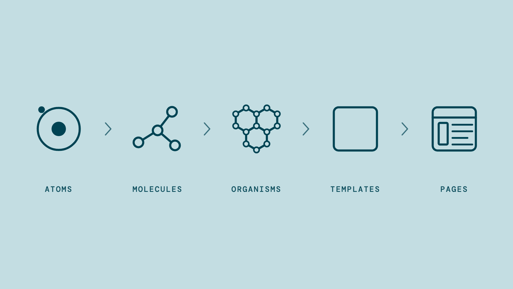
I structured the system on Atomic Design. Drawing from Sun World’s brand guidelines, I started with the atoms, the foundation: color and semantic tokens, typography scales, spacing grids, shadows and layout rules, plus a custom 11-category icon set covering domain concepts like growers, nurseries and royalty tracking that standard libraries don’t ship. From there I combined them into molecules, ten component families spanning buttons through modals, each with distinct states and usage guidance.
The palette grew. Brand color alone can’t run a platform like this, so it split into five: brand, neutral, surface, semantic, and data visualization. Semantic carries state: success for confirmations, positive KPIs and approved statuses, warning for pending actions, error for validation failures and critical issues, info for neutral system notices.

That split resolved the audit’s second finding directly. Status indicators had been carrying their meaning in color alone, an approach that fails accessibility guidelines and anyone reading a screen in direct sunlight, a critical consideration given our users’ outdoor working environments. Status became a pill with the state written in it, color supporting the word rather than carrying it.
I illustrated the agricultural icons myself: growers, nurseries, and the domain concepts no library shipped, then borrowing the rest from Bootstrap Icons.

I didn’t build those in isolation. I tested atoms and molecules on real page layouts using Claude Code and Cursor as I went, validating header hierarchies in context before scaling anything into organisms and templates. The page skeletons that came out of it proved how elements fit real workflows, and they did it before I asked engineering to refactor a single screen.
Solution
Three table libraries, one cohesive look
The biggest technical challenge was table standardization. Tables lost their headers on scroll. In a dataset of any length that means scrolling back up to remember what a column holds, and then losing your place on the way down. Headers became sticky.
Seedling relied on three different table implementations, each serving a distinct purpose: Ant Design for complex management dashboards, DataTables for lightweight read-only datasets, and Handsontable for spreadsheet-style editing in planting and royalty workflows.
Replacing all three with a single engine wasn’t realistic, as a complete rewrite would have taken months of valuable engineering time. Instead, I kept each library and focused on unifying the presentation: aligning typography, row height, sticky headers, pagination, selection states, colors, and button placement across all three technical environments. Every fix had to hold three times, inside three sets of technical limits.
I set up test environments so I could refine each library’s styling before pushing updates to the live product.

Ant Design

DataTables

Handsontable
Collaborating closely during implementation
I worked alongside engineering throughout implementation, reviewing technical feasibility, working through constraints, and refining components as edge cases came up. The lead developer and I created an annotation system in Figma to review audit findings together using status tags (Good, Improvement, Fix, Idea) to track every thread from raise to resolution.

Engineering carried the system into the codebase by replacing custom CSS with shared components, setting up a unified Ant Design theme, and establishing clear naming conventions for future development. That’s where the audit’s third finding got settled: navigation had carried both “Nursery” and “Nurseries,” so it standardized on Nursery and the naming rule went into the codebase.
As components went live in development builds, I reviewed them directly in the product to improve scannability, add card structures for dense information, create collapsible sections for complex forms, and boost text contrast for better accessibility. Users were coming off paper and spreadsheets into screens that show a great deal at once, so cards group related information and collapsible sections let someone meet one part of a task at a time. Both are cognitive load decisions, made for the same reason.


Automating guardrails to keep the system intact
Design systems often slip over time when tight deadlines lead to inline tweaks and custom styles.
To prevent drift, design and engineering worked together to build automated tooling directly into the development workflow: a validation script that scans code for UI inconsistencies before deployment. It flags inline CSS, hardcoded colors, mismatched button spacing, and missing component classes early during code reviews.
We also set up Cursor rules and contributor guidelines so AI-assisted development tools naturally generate code that adheres to our system tokens.

Flags drift before deploy

Catches it in code review

Keeps AI tools on-system
Impact
Impact and ongoing adoption
The Figma system covers six foundational areas, ten component families, and an 11-category custom icon set. Phase 1 standardization reached six of the platform’s eight modules while maintaining sprint velocity. Three table libraries now share a consistent design language, and automated linting keeps new code aligned by default.
The system now serves as the solid foundation for Seedling’s continued growth, with every new feature built straight from these shared elements.
Reflections
What I learned
Successful adoption requires thoughtful rollout planning. By delivering reusable components before asking for screen refactors, I built trust with engineering and kept migration moving smoothly alongside feature work.
Tooling reinforces good intentions. While documentation sets the standard, integrating validation checks right into the CI/CD pipeline is what actually protects the design system over time.
Feedback
“Adithi has been crucial in evolving our home-grown application, Seedling. She took on the massive task of creating a design system from scratch, and by standardizing the platform’s look and feel, she brought much-needed consistency and significantly elevated the user experience. Adithi is a skilled product designer who understands how to scale a product while keeping the user first. She would be an incredible asset to any design team!”

Alex Cirerra
Product Manager for the Seedling project at Sun World International
Curious to know more?
Want to hear more about how the system came together? I’m happy to chat more about my process over a call. Reach out to me at hello[dot]adidee[at]gmail[dot]com!
Next up
Sun World Root App
A mobile app built from scratch that brings three of Sun World’s workflows into one place.
Seedling Design System: Standardizing Sun World’s enterprise platform UI
Design System
Live Project
Role
UX Designer
Outcome
Shipped
Timeline
Ongoing
TL;DR
Sun World International’s Seedling platform manages contracts, orders, royalties, and compliance for its global grower-licensing business. As the sole designer, I built a design system to unify the UI across Sun World’s wider ecosystem: the breeding system, the licensing system, Seedling, and the mobile app. I audited the experience, studied how other teams had done it, and worked with engineering to carry it into the codebase, driving cross-platform consistency for a global user base with widely varying technical literacy. Phase 1 standardized six of eight modules and brought three separate table libraries under one visual language.
Context
One platform that looked like several
When evaluating Sun World’s digital ecosystem (which spans the breeding system, licensing system, Seedling, and the mobile app), I realized our products felt disconnected. Our users include agronomists, researchers, and field workers spread across multiple countries, languages, and technical backgrounds. Many were accustomed to paper-based processes and Excel spreadsheets, creating significant learnability hurdles as the business transitioned to a digital workflow. Consistency across platforms was the way to reduce that cost.
As Seedling moved toward its MVP, feature teams built in parallel without a shared foundation. Developers relied on different Bootstrap UI libraries to meet tight deadlines, which led to noticeable visual drift in buttons, typography, spacing, and interaction patterns across modules. To address this growing design debt, I took the initiative to establish a dedicated design system. Having never built one from scratch, I studied how other teams had: the Atlassian Design System, Google’s Material Design, Apple’s Human Interface Guidelines, and Brad Frost’s Atomic Design methodology.
I did a sitewide audit and presented our findings to the Seedling team, laying out the practical benefits alongside the effort required from each discipline. To address engineering concerns about taking time away from the MVP backlog, I structured a phased rollout: I built reusable components first so engineers had ready-to-use parts before asking anyone to refactor existing screens. Because product development couldn’t stop, I scheduled the UI migration to run right alongside active feature work instead of delaying it.
Process
From audit to system priorities
I started with a thorough sitewide audit across all their modules; Contracts, Royalty, Invoices, Nursery, Grower, Distribution, Document Builder, Importer, and the homepage. I organized user flows into ten clear issue categories with concrete recommendations. The findings ranged from minor visual fixes to significant usability issues: tables lost headers on scroll, status indicators relied only on color, and navigation used duplicate labels like “Nursery” and “Nurseries.” This audit gave me both the compelling case for the system and the practical roadmap to build it.
I structured the system on Atomic Design. Drawing from Sun World’s brand guidelines, I started with the atoms, the foundation: color and semantic tokens, typography scales, spacing grids, shadows and layout rules, plus a custom 11-category icon set covering domain concepts like growers, nurseries and royalty tracking that standard libraries don’t ship. From there I combined them into molecules, ten component families spanning buttons through modals, each with distinct states and usage guidance.
The palette grew. Brand color alone can’t run a platform like this, so it split into five: brand, neutral, surface, semantic, and data visualization. Semantic carries state: success for confirmations, positive KPIs and approved statuses, warning for pending actions, error for validation failures and critical issues, info for neutral system notices.
That split resolved the audit’s second finding directly. Status indicators had been carrying their meaning in color alone, an approach that fails accessibility guidelines and anyone reading a screen in direct sunlight, a critical consideration given our users’ outdoor working environments. Status became a pill with the state written in it, color supporting the word rather than carrying it.
I illustrated the agricultural icons myself: growers, nurseries, and the domain concepts no library shipped, then borrowing the rest from Bootstrap Icons.
I didn’t build those in isolation. I tested atoms and molecules on real page layouts using Claude Code and Cursor as I went, validating header hierarchies in context before scaling anything into organisms and templates. The page skeletons that came out of it proved how elements fit real workflows, and they did it before I asked engineering to refactor a single screen.
Solution
Three table libraries, one cohesive look
The biggest technical challenge was table standardization. Tables lost their headers on scroll. In a dataset of any length that means scrolling back up to remember what a column holds, and then losing your place on the way down. Headers became sticky.
Seedling relied on three different table implementations, each serving a distinct purpose: Ant Design for complex management dashboards, DataTables for lightweight read-only datasets, and Handsontable for spreadsheet-style editing in planting and royalty workflows.
Replacing all three with a single engine wasn’t realistic, as a complete rewrite would have taken months of valuable engineering time. Instead, I kept each library and focused on unifying the presentation: aligning typography, row height, sticky headers, pagination, selection states, colors, and button placement across all three technical environments. Every fix had to hold three times, inside three sets of technical limits.
I set up test environments so I could refine each library’s styling before pushing updates to the live product.
Ant Design
DataTables
Handsontable
Collaborating closely during implementation
I worked alongside engineering throughout implementation, reviewing technical feasibility, working through constraints, and refining components as edge cases came up. The lead developer and I created an annotation system in Figma to review audit findings together using status tags (Good, Improvement, Fix, Idea) to track every thread from raise to resolution.
Engineering carried the system into the codebase by replacing custom CSS with shared components, setting up a unified Ant Design theme, and establishing clear naming conventions for future development. That’s where the audit’s third finding got settled: navigation had carried both “Nursery” and “Nurseries,” so it standardized on Nursery and the naming rule went into the codebase.
As components went live in development builds, I reviewed them directly in the product to improve scannability, add card structures for dense information, create collapsible sections for complex forms, and boost text contrast for better accessibility. Users were coming off paper and spreadsheets into screens that show a great deal at once, so cards group related information and collapsible sections let someone meet one part of a task at a time. Both are cognitive load decisions, made for the same reason.
Automating guardrails to keep the system intact
Design systems often slip over time when tight deadlines lead to inline tweaks and custom styles.
To prevent drift, design and engineering worked together to build automated tooling directly into the development workflow: a validation script that scans code for UI inconsistencies before deployment. It flags inline CSS, hardcoded colors, mismatched button spacing, and missing component classes early during code reviews.
We also set up Cursor rules and contributor guidelines so AI-assisted development tools naturally generate code that adheres to our system tokens.
Flags drift before deploy
Catches it in code review
Keeps AI tools on-system
Impact
Impact and ongoing adoption
The Figma system covers six foundational areas, ten component families, and an 11-category custom icon set. Phase 1 standardization reached six of the platform’s eight modules while maintaining sprint velocity. Three table libraries now share a consistent design language, and automated linting keeps new code aligned by default.
The system now serves as the solid foundation for Seedling’s continued growth, with every new feature built straight from these shared elements.
Reflections
What I learned
Successful adoption requires thoughtful rollout planning. By delivering reusable components before asking for screen refactors, I built trust with engineering and kept migration moving smoothly alongside feature work.
Tooling reinforces good intentions. While documentation sets the standard, integrating validation checks right into the CI/CD pipeline is what actually protects the design system over time.
Feedback
“Adithi has been crucial in evolving our home-grown application, Seedling. She took on the massive task of creating a design system from scratch, and by standardizing the platform’s look and feel, she brought much-needed consistency and significantly elevated the user experience. Adithi is a skilled product designer who understands how to scale a product while keeping the user first. She would be an incredible asset to any design team!”
Alex Cirerra
Product Manager for the Seedling project at Sun World International
Curious to know more?
Want to hear more about how the system came together? I’m happy to chat more about my process over a call. Reach out to me at hello[dot]adidee[at]gmail[dot]com!
Next up
Sun World Root App
A mobile app built from scratch that brings three of Sun World’s workflows into one place.
Seedling Design System: Standardizing Sun World’s enterprise platform UI
Design System
Live Project
Role
UX Designer
Outcome
Shipped
Timeline
Ongoing
TL;DR
Sun World International’s Seedling platform manages contracts, orders, royalties, and compliance for its global grower-licensing business. As the sole designer, I built a design system to unify the UI across Sun World’s wider ecosystem: the breeding system, the licensing system, Seedling, and the mobile app. I audited the experience, studied how other teams had done it, and worked with engineering to carry it into the codebase, driving cross-platform consistency for a global user base with widely varying technical literacy. Phase 1 standardized six of eight modules and brought three separate table libraries under one visual language.
Context
One platform that looked like several
When evaluating Sun World’s digital ecosystem (which spans the breeding system, licensing system, Seedling, and the mobile app), I realized our products felt disconnected. Our users include agronomists, researchers, and field workers spread across multiple countries, languages, and technical backgrounds. Many were accustomed to paper-based processes and Excel spreadsheets, creating significant learnability hurdles as the business transitioned to a digital workflow. Consistency across platforms was the way to reduce that cost.
As Seedling moved toward its MVP, feature teams built in parallel without a shared foundation. Developers relied on different Bootstrap UI libraries to meet tight deadlines, which led to noticeable visual drift in buttons, typography, spacing, and interaction patterns across modules. To address this growing design debt, I took the initiative to establish a dedicated design system. Having never built one from scratch, I studied how other teams had: the Atlassian Design System, Google’s Material Design, Apple’s Human Interface Guidelines, and Brad Frost’s Atomic Design methodology.
I did a sitewide audit and presented our findings to the Seedling team, laying out the practical benefits alongside the effort required from each discipline. To address engineering concerns about taking time away from the MVP backlog, I structured a phased rollout: I built reusable components first so engineers had ready-to-use parts before asking anyone to refactor existing screens. Because product development couldn’t stop, I scheduled the UI migration to run right alongside active feature work instead of delaying it.
Process
From audit to system priorities
I started with a thorough sitewide audit across all their modules; Contracts, Royalty, Invoices, Nursery, Grower, Distribution, Document Builder, Importer, and the homepage. I organized user flows into ten clear issue categories with concrete recommendations. The findings ranged from minor visual fixes to significant usability issues: tables lost headers on scroll, status indicators relied only on color, and navigation used duplicate labels like “Nursery” and “Nurseries.” This audit gave me both the compelling case for the system and the practical roadmap to build it.
I structured the system on Atomic Design. Drawing from Sun World’s brand guidelines, I started with the atoms, the foundation: color and semantic tokens, typography scales, spacing grids, shadows and layout rules, plus a custom 11-category icon set covering domain concepts like growers, nurseries and royalty tracking that standard libraries don’t ship. From there I combined them into molecules, ten component families spanning buttons through modals, each with distinct states and usage guidance.
The palette grew. Brand color alone can’t run a platform like this, so it split into five: brand, neutral, surface, semantic, and data visualization. Semantic carries state: success for confirmations, positive KPIs and approved statuses, warning for pending actions, error for validation failures and critical issues, info for neutral system notices.
That split resolved the audit’s second finding directly. Status indicators had been carrying their meaning in color alone, an approach that fails accessibility guidelines and anyone reading a screen in direct sunlight, a critical consideration given our users’ outdoor working environments. Status became a pill with the state written in it, color supporting the word rather than carrying it.
I illustrated the agricultural icons myself: growers, nurseries, and the domain concepts no library shipped, then borrowing the rest from Bootstrap Icons.
I didn’t build those in isolation. I tested atoms and molecules on real page layouts using Claude Code and Cursor as I went, validating header hierarchies in context before scaling anything into organisms and templates. The page skeletons that came out of it proved how elements fit real workflows, and they did it before I asked engineering to refactor a single screen.
Solution
Three table libraries, one cohesive look
The biggest technical challenge was table standardization. Tables lost their headers on scroll. In a dataset of any length that means scrolling back up to remember what a column holds, and then losing your place on the way down. Headers became sticky.
Seedling relied on three different table implementations, each serving a distinct purpose: Ant Design for complex management dashboards, DataTables for lightweight read-only datasets, and Handsontable for spreadsheet-style editing in planting and royalty workflows.
Replacing all three with a single engine wasn’t realistic, as a complete rewrite would have taken months of valuable engineering time. Instead, I kept each library and focused on unifying the presentation: aligning typography, row height, sticky headers, pagination, selection states, colors, and button placement across all three technical environments. Every fix had to hold three times, inside three sets of technical limits.
I set up test environments so I could refine each library’s styling before pushing updates to the live product.
Ant Design
DataTables
Handsontable
Collaborating closely during implementation
I worked alongside engineering throughout implementation, reviewing technical feasibility, working through constraints, and refining components as edge cases came up. The lead developer and I created an annotation system in Figma to review audit findings together using status tags (Good, Improvement, Fix, Idea) to track every thread from raise to resolution.
Engineering carried the system into the codebase by replacing custom CSS with shared components, setting up a unified Ant Design theme, and establishing clear naming conventions for future development. That’s where the audit’s third finding got settled: navigation had carried both “Nursery” and “Nurseries,” so it standardized on Nursery and the naming rule went into the codebase.
As components went live in development builds, I reviewed them directly in the product to improve scannability, add card structures for dense information, create collapsible sections for complex forms, and boost text contrast for better accessibility. Users were coming off paper and spreadsheets into screens that show a great deal at once, so cards group related information and collapsible sections let someone meet one part of a task at a time. Both are cognitive load decisions, made for the same reason.
Automating guardrails to keep the system intact
Design systems often slip over time when tight deadlines lead to inline tweaks and custom styles.
To prevent drift, design and engineering worked together to build automated tooling directly into the development workflow: a validation script that scans code for UI inconsistencies before deployment. It flags inline CSS, hardcoded colors, mismatched button spacing, and missing component classes early during code reviews.
We also set up Cursor rules and contributor guidelines so AI-assisted development tools naturally generate code that adheres to our system tokens.
Flags drift before deploy
Catches it in code review
Keeps AI tools on-system
Impact
Impact and ongoing adoption
The Figma system covers six foundational areas, ten component families, and an 11-category custom icon set. Phase 1 standardization reached six of the platform’s eight modules while maintaining sprint velocity. Three table libraries now share a consistent design language, and automated linting keeps new code aligned by default.
The system now serves as the solid foundation for Seedling’s continued growth, with every new feature built straight from these shared elements.
Reflections
What I learned
Successful adoption requires thoughtful rollout planning. By delivering reusable components before asking for screen refactors, I built trust with engineering and kept migration moving smoothly alongside feature work.
Tooling reinforces good intentions. While documentation sets the standard, integrating validation checks right into the CI/CD pipeline is what actually protects the design system over time.
Feedback
“Adithi has been crucial in evolving our home-grown application, Seedling. She took on the massive task of creating a design system from scratch, and by standardizing the platform’s look and feel, she brought much-needed consistency and significantly elevated the user experience. Adithi is a skilled product designer who understands how to scale a product while keeping the user first. She would be an incredible asset to any design team!”
Alex Cirerra
Product Manager for the Seedling project at Sun World International
Curious to know more?
Want to hear more about how the system came together? I’m happy to chat more about my process over a call. Reach out to me at hello[dot]adidee[at]gmail[dot]com!
Next up
Sun World Root App
A mobile app built from scratch that brings three of Sun World’s workflows into one place.